1998
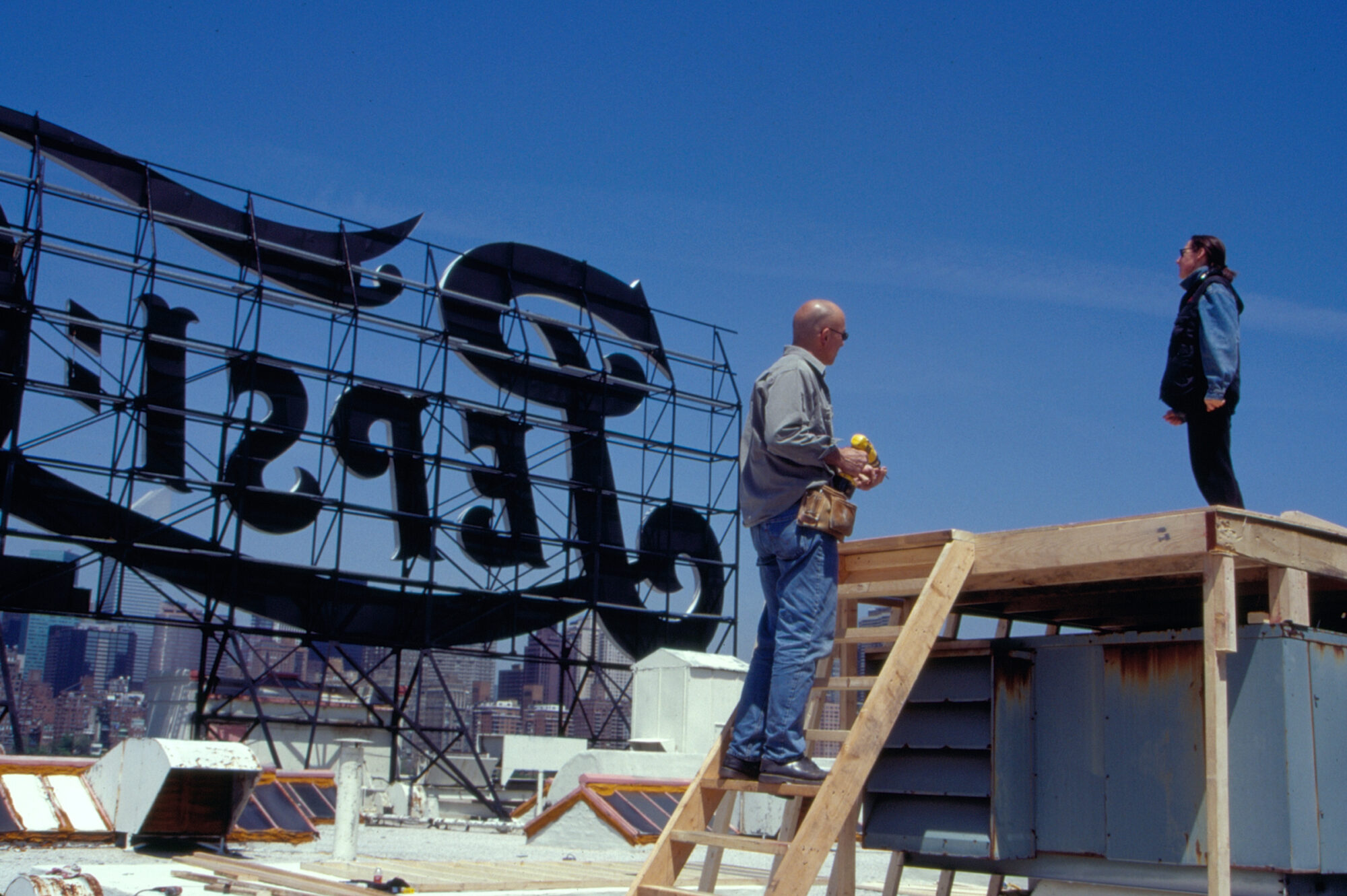
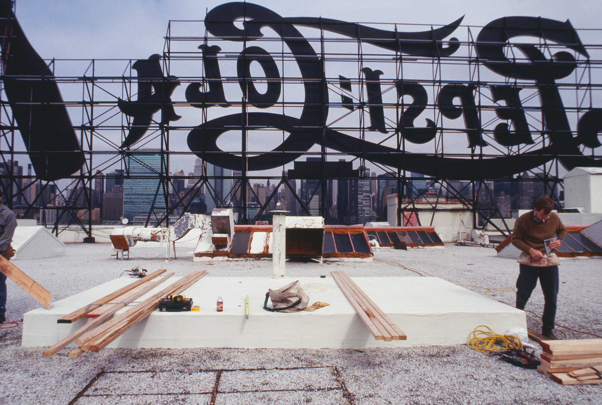
When I photographed the Pepsi Cola sign in the Spring of 1998, it had been mounted on the roof of the company’s Long Island City-based bottling plant for roughly seventy years. Standing as an icon of popular culture and commercial prominence, the sign was a significant, if aging, fixture in the view looking east from Manhattan.
Made shortly before the building’s closure, my photographs of the sign are straightforward in presentation. The Pepsi Cola logo, photographed from behind, is made legible by the reversal that takes place inside my camera obscura; an inverted view which is preserved in the final images. Due to the legibility of the sign and its translation into black and white, the photographs serve a purpose similar to the original symbol’s. It is a declaration of what is already widely recognizable and a reminder of Long Island City’s nineteenth and twentieth-century industrial roots.
The images also allude to the self-consciousness inherent in commercialism. With the roof of the building visible in the foreground, I positioned this enormous advertisement as if up on a stage, waiting, after all this time, for its close-up. And from this vantage point, Manhattan just peeks through the supportive armature of the logo, overshadowed by the fading commercial symbol but nevertheless present. From this distinct view, New York City serves as a fitting but marginalized equivalent for Pepsi Cola’s commercial vitality and popular recognition.
In my photographs of the sign’s shadow in the East River, the neighborhoods’ positions are inverted. One sees the whole of Manhattan’s midtown skyline as if gazing at it from the perspective of the sign. With the shadow only faintly visible in the current of the water, the viewer sees what the sign might see, and in effect, steps into the role of the fading icon. But it is through my singular photographs of the individual letters that the ego and personality of the sign are reclaimed. Divorced from the Pepsi Cola logo, they are not simply segments of a whole, but individual entities. Showing, up close, the scaffolding that supports each letter—the jaunty A, the curvaceous L, the skewed O—gives the images a sense of intimacy, a hint as to how they remained standing in their relentless presentation to the world.